Northwest Summer Art Institute
Mailable Booklet, Comprehensive Breakdown
Background:
The Northwest Summer Art Institute is a 501c3 non-profit which offers summer arts classes to the public.
NSAI receives an endowment by the National Endowment for the Arts, but is primarily funded by class fees and charitable donations.
Problem:
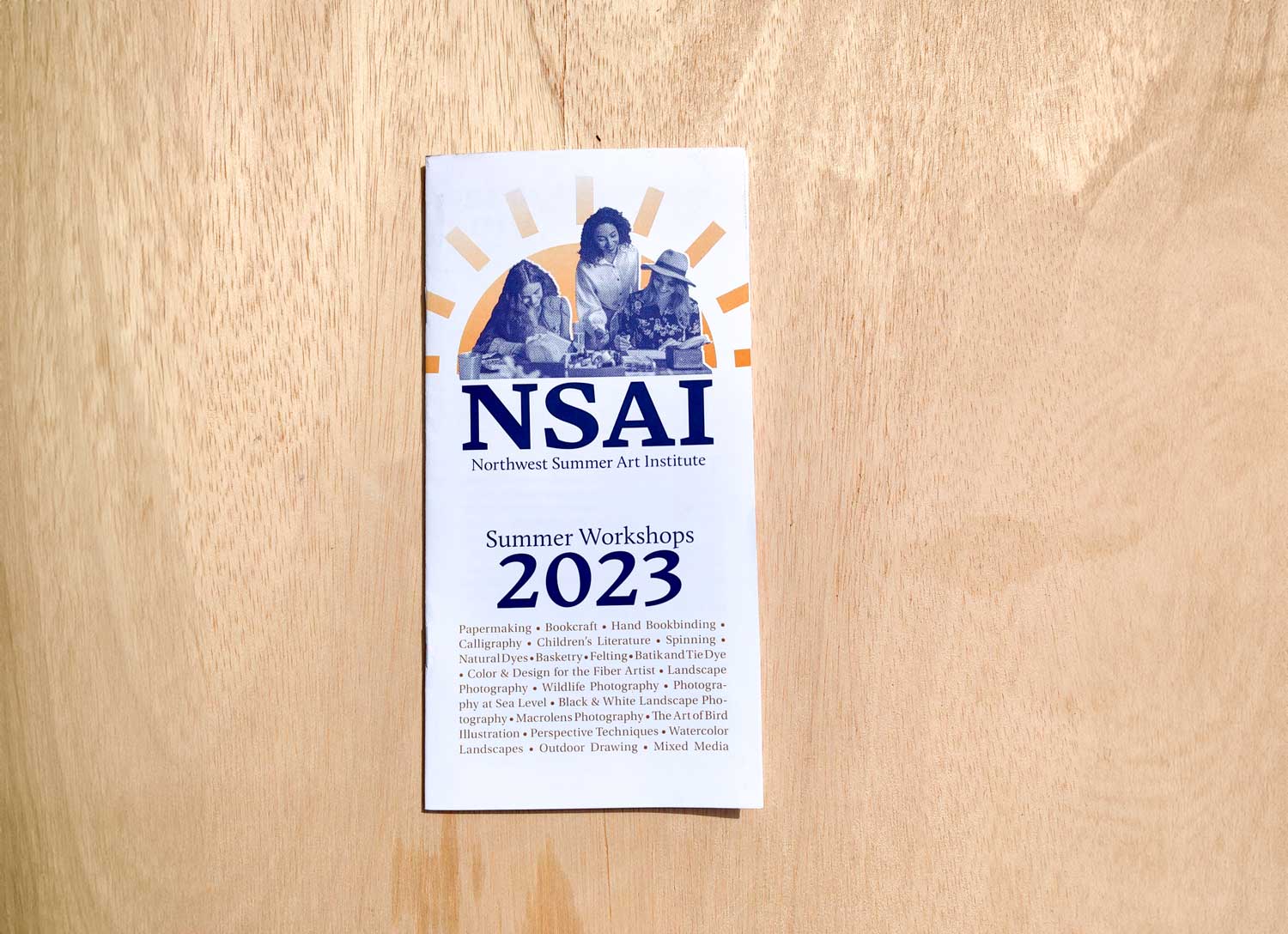
The project required creation of a catalogue of classes with a registration form inside which could be easily mailed out to Whatcom and Skagit County residents for the 2024 year. Due to budget constraints I was conformed to 2-color printing.
Additionally, NSAI needed a simple but cohesive brand identity which they could use in future projects.
Solution:
Using simple line rules, hierarchy, and Photoshop actions I created a booklet which comfortably displayed 2024’s list of classes, complies with two color printing standards and provides a form which can be filled out and returned.
I created a people-oriented identity for NSAI which focuses in on their inclusivity, and makes this catalogue easy to modify for next year’s classes.
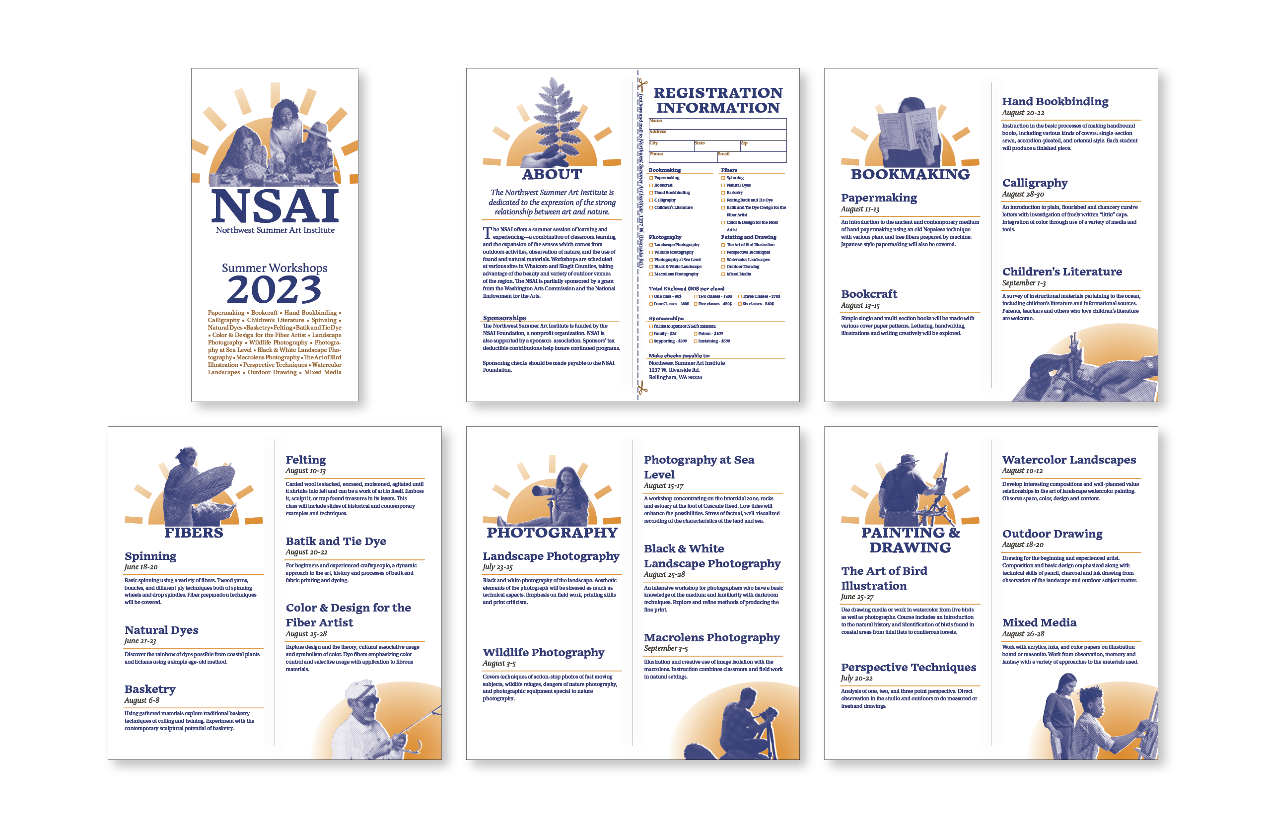
Spreads from inside the booklet. The mailable and fillable form is on the third page.
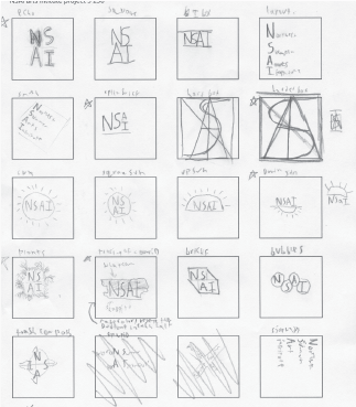
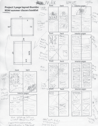
Before I hop on my computer I always start with paper. I make sure to do over 10 thumbnail sketches when working on a logo/lettermark, at at least 3 options for any layouts I might make. Ultimately the 10th thumbnail I drew was what evolved into the final mark.
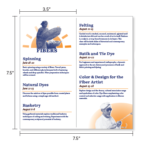
Page Size
I chose a page size of 7.5″ by 3.5″ for two main of reasons. Firstly, it’s small size would allow it to be mailed without packaging at the cheapest rate. Second, It created a unique profile which accentuates the text with it’s vertical layout.
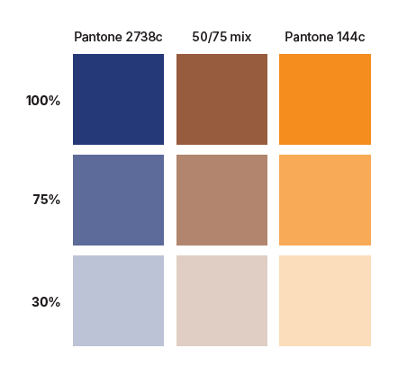
Color
Using Pantone colors ready for two color printing, I chose Pantone 2738c and Pantone 144c, then I created a brown “third color” by mixing the two. The dark blue offers strong and easy to read text, and the orange spices up the layout with brighter highlights.
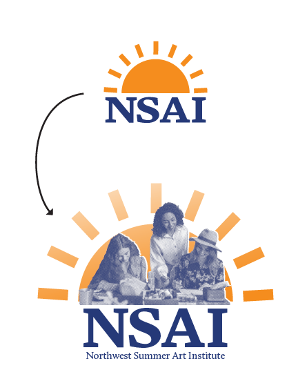
Lettermark
The Northwest Summer Art Institute is dormant most of the year. I chose a rising sun to represent NSAI because of their clear ties to summer, and a rising sun represents new beginnings and a connection to nature and the outdoors NSAI strives for with it’s photography and outdoor painting classes.
The NSAI lettermark too is made to draw your attention to the people who make up this community by showing them literally front ant center
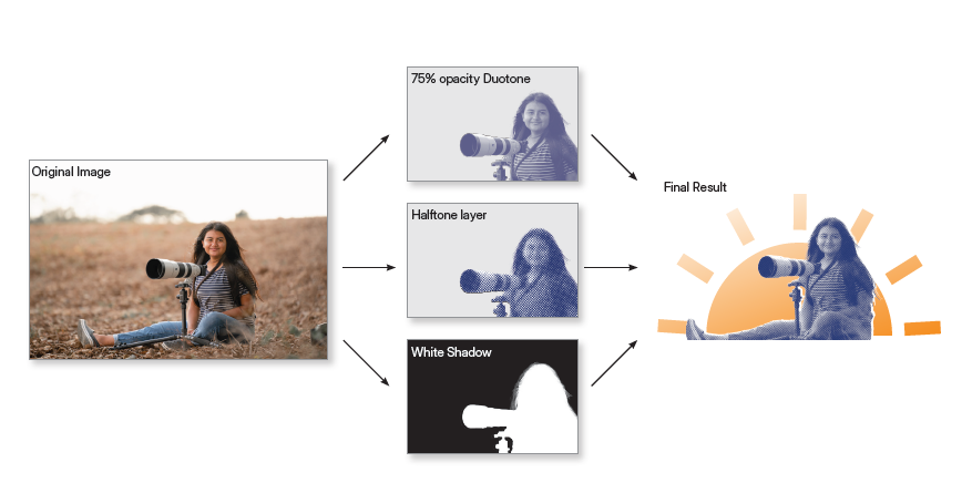
To standardize the style of this booklet in a repeatable way, I created a complex Photoshop action to unify all the images present in the booklet. This action converts the images to our two color duotone, then creates a halftone and offset shadow which are used to stylize the resulting photo.

