Big Hare Cycles
Letterhead & Stationary, Brand Identity
Background:
Big Hare Cycles is a startup company based out of Seattle dedicated to producing simple, durable commuter cycles.

Problem:
Big Hare Cycles is a new business, still putting together it’s brand and marketing materials and message. They needed a new branding style which reflected their focus on simplicity, durability, and daily use.
Solution:
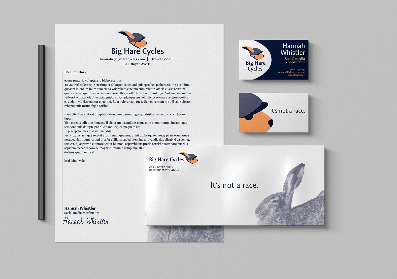
Fitting their focus on simplicity I created a logo which held personality, a hare with a serious face to go alongside their firm language and simple message. I created their stationery in a similar vein, maintaining a simple but consistent attitude across each piece


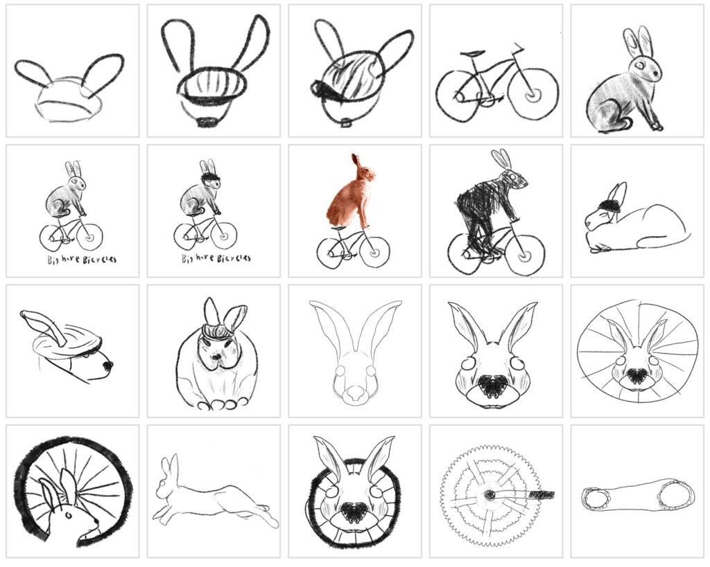
I went through a series of hare-based logos/lettermarks before digging into my final design.

